Overview
Mellerware is a brand specialized in small domestic appliances. It belongs to the giant Taurus Group. We were asked to do an audit on their current website to see ways of improving their conversion.
The goal?
To improve their e-commerce conversion rate by auditing the existing & analyzing best practices.
MY ROLE :
UX Designer
Who is our main user?
After looking at Analytics for the past years, we discovered:

Who? Woman (75%) 35-65yo.
How do they find us? Facebook (58%). / Paid search (25%).
From what device? Mobile, Android (70%)
Current process
Buying a vaccum cleaner flow:
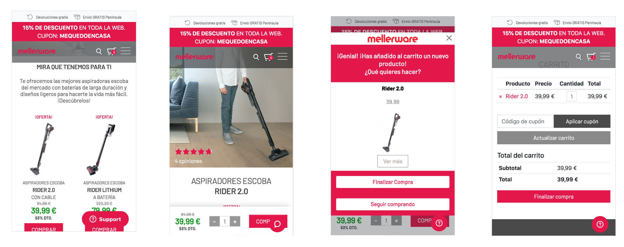

🧠 Takeaways
After observing the current process of buying I encountered the following:
Navigation takes up 1⁄4 of the page
Unclear CTA stepped on by chatbot
Cart without a "continue shopping" button
Available payment methods are not visible until checkout
Cannot purchase as a guest
Complicated check-out form
Checkout without clear steps and with fixed navigation elements
How might we redesign the buying process to make it more friendly and better convert?
🧚🏼 General improvements
✅PERFORMANCE & SECURITY
● Improve loading speed of the entire web
● Secure site certificate (SSL) + badges
📦 SHIPPING COSTs, warranty & DELIVERY INFORMATION UPFRONT
● Clear shipping costs throughout the web (no surprises in the cart)?
● Delivery times / Pick up in-store
● Warranty or visible return policy
📱 MOBILE-FIRST
● Assistance buying (WhatsApp)
● Optimize form (Give the corresponding keyboard according to the cell, make use of autocomplete)
💶ADAPTED PAYMENT METHODS
● Add Digital Wallets (Apple pay, google pay, and Samsung pay) + Paypal
● Bank transfer
💳 CHECKOUT PROCESS OPTIMIZATION
● Optimize the checkout process (in steps, without navigation elements, visible payment methods.
● Discount coupon yes but, for a limited time
● Follow-up email (Cart abandonment follow up) - an email with the contents of your cart, as well as a coupon code to get a discount as an incentive to complete your order.
Top features

Cross-selling & €uros left for free delivery
We included a section on the cart and also the cart preview to show products that were usually bought together. Also to encourage buying another product we include how much money was left to get a free delivery.

Guest & Social checkout
We included the possibility to checkout as a guest or via Facebook.

Digital wallets
Express payment option through Apple, Google, Samsung pay and Paypal

Bank transfer
Analyzing competitors and our user persona, bank transfer was a regular payment method.